There are many obstacles and challenges that formerly incarcerated individuals face as they try to reintegrate into society. A huge struggle in this process is a lack of employment options for individuals with a previous criminal history. Tiltas, meaning bridge in Lithuanian, aims to redefine reentry by connecting returning citizens to resources and job opportunities in the hopes of reducing recidivism rates. A person's past should not dictate his or her future. Tiltas has a mission to change the narrative.
The founder and CEO of Tiltas, Tiffany Smith, worked on this startup while involved in the Northwestern Kellogg Entrepreneur’s Organization and the management school’s Entrepreneurship Club. Our process began with meeting Tiffany to get a feel for her project intentions and expectations. She had some previous design experience with a BA in architecture and certification in web development, but was looking to our team to help expand her vision and create a unique look and feel for her application. Tiffany was a spirited individual who intended to be hands on for user testing due to her established connections and access to felons at various halfway houses and employment networks. Our job was to deliver a design that realized her vision and fulfilled the needs of the user audience.
We kicked off our design challenge with a visual analysis of the following companies; this helped us differentiate the successful and unsuccessful key elements and design patterns we planned to incorporate.

Column A: Job search sites with resources for the formerly incarcerated.
Column B: General job search sites
Column C: Products the formerly incarcerated were familiar with.
Column D: Products with elements the client wanted her product to emulate.

70 Million Jobs is a job search site connecting the formerly incarcerated with employers willing to hire Americans with a criminal record. Their inconsistent alignment and lack of breathable spacing made content overwhelming and difficult to follow and read. They used a generic blue color found in many similar applications. Blue is so often used because it is not a distracting color and can fade into the background; it symbolizes trustworthiness, calm, and promotes interaction.

Snagajob is a multi-platform general job search site that also has resources, tips, and tricks for felons that need jobs. They used white space to separate the content effectively and company logos in the job posting section for recognizability and scannability. The orange header was vibrant and attention-grabbing.
Takeaway: Company logos next to job postings make content more scannable and helps build trust.


Monster is a popular job search site with career advice and other related resources. They used ample white space with a bright accent purple. They had a well organized chat and a modern, clean look.
Indeed is an employment related search engine for job postings. They used a generic blue as their main color. They used cards to organize their postings and different font weights and color to give hierarchy to their listings.
LinkedIn is a business- and employment-oriented social networking platform. The spacing and amount of content was overwhelming and they also generic blue. The large user profile photo added personalization and engagement and was the most eye-catching element on the screen.
Takeaway: Cards, color and different font weights help organize and separate content heavy sections.

Edovo is a tablet-based educational platform available for inmates to rent while serving their sentence. Their large icon styles gave it an outdated look, the inconsistency of three different styles of icons caused the design to look incohesive, the use of a dark background without a lot of contrast made it feel cold, uninviting, and hard to read.

Facebook is a popular social media and social networking platform; there were groups for ex-offenders that posted employment notices of companies hiring felons. Facebook incorporated icons next to the list item categories to assist with recognition. They used white space effectively to create scannability. Most major social media platforms used blue for the reasons previously mentioned. Also, Mark Zuckerberg is red-green colorblind so blue was the richest color for him.
Takeaway: Overly dark backgrounds and low contrast tire the eye and feel uninviting.


Victor is a mobile tool providing resources for the military community and their families. They used ample white space, large iconography with labels, and large images for added interest. This was successful to make actions clear and simple and engage the users.
Turo is a digital marketplace offering unique cars for rent by local hosts. This was another example of a design that incorporated large photographs and iconography with labels. The large photographs were eye-catching and engaging and the icons helped separate and clarify the list categories.
Airbnb is a digital marketplace and hospitality service, enabling people to lease or rent short-term lodging. They had a well structured chat feature with user profile pictures to add engagement and build trust.
Takeaway: Icons and images used to label list items make content more clear and scannable.
We continued our process by dissecting our UX team's research and wireframes. We made note of the following:


All of our research, in addition to the client’s final request that the app be “dope” and attention-grabbing, directly influenced our decisions in crafting Tiltas’ design principles.

Tiltas users came from high-stress environments, making a trustworthy experience extremely important. To build this trust, Tiltas emphasizes user photos, promotes dialogue, and uses reassuring language.

The journey for returning citizens can be discouraging. Tiltas reinforces positivity through language, success screens, and reminders to help users find employment and avoid recidivism.

Tiltas users may lack familiarity with today’s technologies, patterns, and interactions. Tiltas employs larger text, clear icons and instructions, and recognizable patterns so users can easily and accurately navigate through tasks.

Tiltas users must be engaged from the start and feel cool using the product or else they will quickly give up. Tiltas uses bold colors, contrast, and photography to be hip and tight so that users will recommend to friends.
With the aforementioned knowledge and principles in mind I set about creating three style tiles. Tiltas’ established brand was monochromatic with a lemon yellow logo and call to action:

For this reason I decided to incorporate yellow into each of my style tiles.

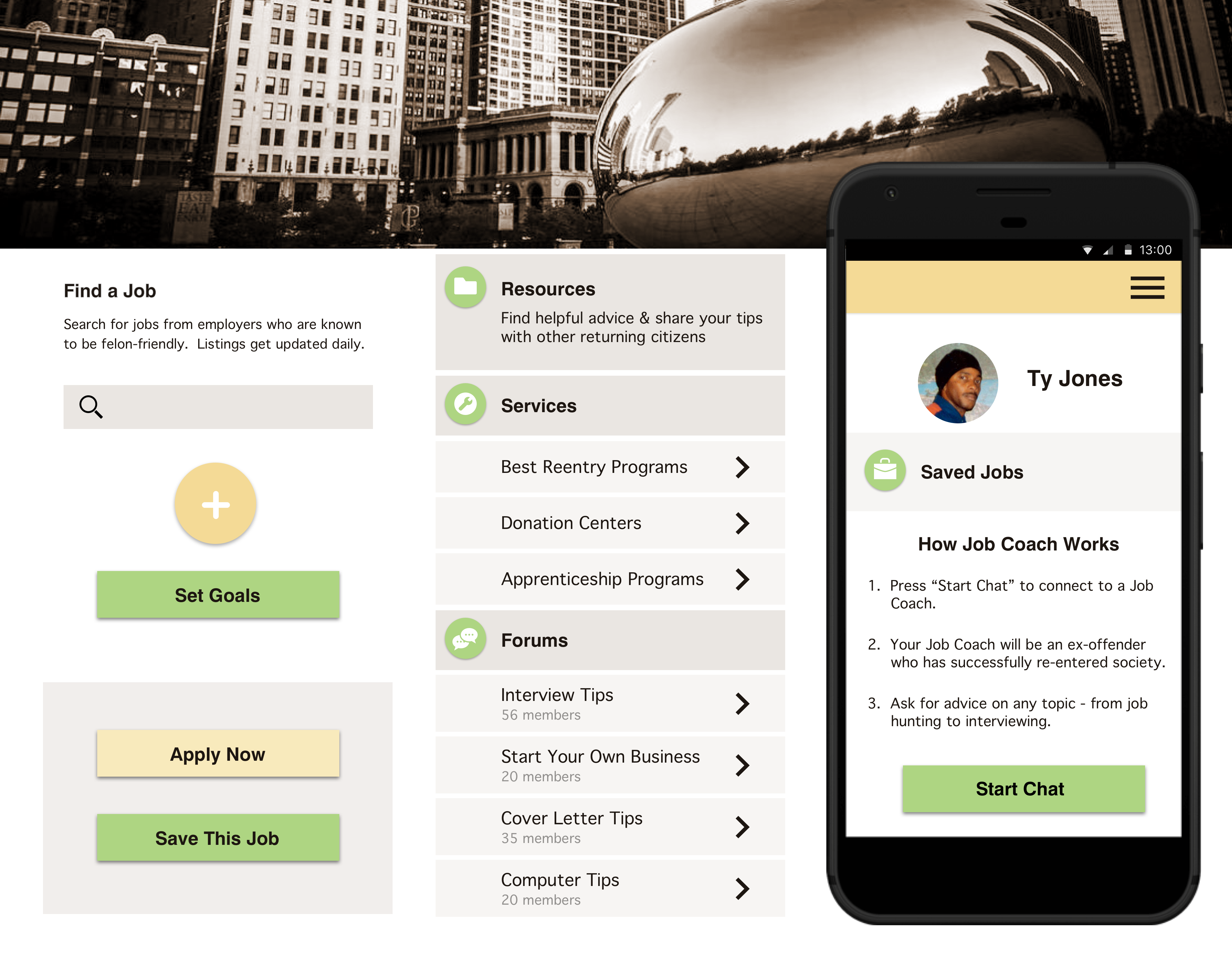
Urban Landscape. I explored using a variation of the popular blue from the competitive analysis as a background color to be familiar, yet attention-grabbing. I used cards to add contrast and incorporate the use of white space. I chose to use the font Avenir because it translated well in multiple weights and sizes across all media platforms. Avenir was created by combining the popular, modern geometric sans-serif style typeface with organic elements to give the design a human feel. Also, Avenir was recently used on popular products released by companies like Samsung, Apple, and Snapchat so it would help with familiarity as well as legibility. I implemented rounded buttons and chat bubbles for approachability and friendliness against the cool blue color. I included the large header city image as motivation for users to go hit the street after being contained for years.
Clean and modern. My second style tile drew upon inspiration from the Victor app. I focused on using ample amounts of white space with large icons and text so that actions were clear and obvious. I used the color palette from Tiltas’ marketing site with bold contrast; the sparse use of yellow made it especially attention-grabbing. I used the font Futura to give it a cool and modern feel per design principle 04.
Professional and organized. I again used a large monochromatic city header image for familiarity and motivation and treated it with a filter to make it look warmer. I toned down the Tiltas yellow, added green for interest, but still used color sparingly for clear action items. I assigned icons to the main list items for better hierarchy and scannability. I chose to use Geneva, a realist sans-serif font, for its approachability and familiarity; it was one of the oldest fonts shipped with the Macintosh operating system and it was recently utilized by Facebook in status posts.
We presented our findings and style explorations to the client for feedback on how to proceed. She preferred my second style tile overall, but wanted to see specific elements added from the other two:
The initial screens we chose to mock-up were important to the functionality of the app and showcased a variety of UI elements and design patterns. I had previously only designed for iOS so the challenge of familiarizing myself with material design was new. To overcome this challenge I researched material design patterns online, downloaded Android UI kits, and explored different Android phones that were owned by acquaintances of mine.

To ensure my designs were headed in the right direction and aligned with our principles, we conducted user testing with a variety of people from our target audience. These were men and women, aged 25–60, who had been incarcerated for varying lengths of time. We displayed our designs on a phone and asked them to list any adjectives that came to mind. We had them think out loud from screen to screen and comment on the elements that caught their attention. I tested specifically for:
The first individuals we tested were released from prison over a year ago and successfully found employment. They used the adjectives straightforward, clean, and “tight.” They declared appreciation for the city skyline photo and identified connection to the city of Chicago.
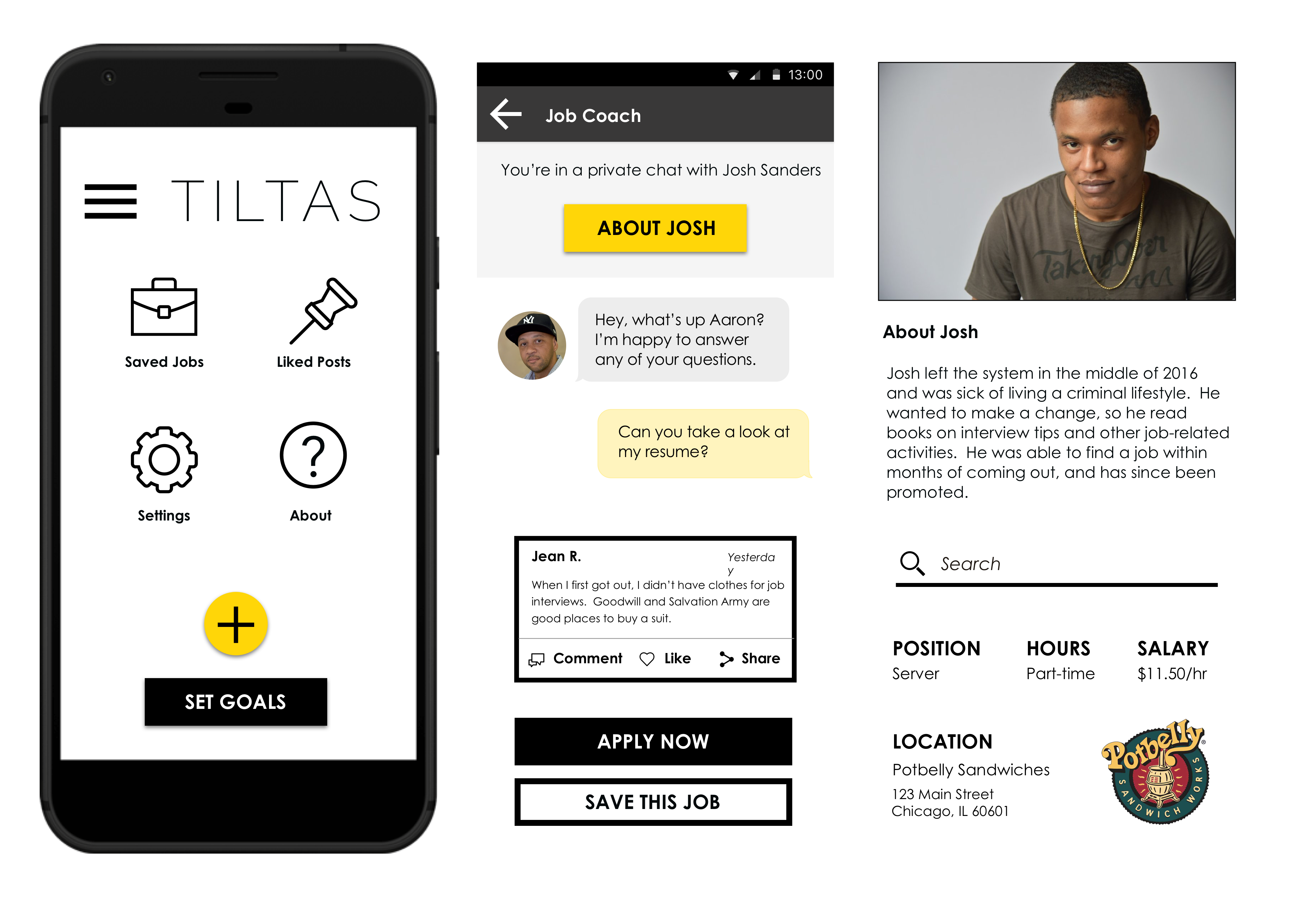
We then went into the field to test the effectiveness of our design choices with a slightly different demographic. We were granted access to the residents at a campus where federal prisoners served the last term of their sentences. “Straightforward, simple, easy, but you gotta remember that common sense is not common” was a quote from one of the inmates; we were on the right track of keeping it easy and basic per design principle 03. Another inmate stressed how important it was for the design to be bold and attention-grabbing since prison was so gray and bleak. There was a suggestion that the city photo on the splash screen be replaced with an image that was better connected to the project. The testers unanimously responded positively to the inclusion of company logos on the job postings. The logos aided in recognition and legitimacy thus established a feeling of trust.
During the first round of testing I made my own observation of how prominent the large city photo was on every screen. I knew I was going against best practices by allowing so much space to be occupied by the header, but large hero images were a client preference during the kickoff meeting. I additionally wanted to explore this option with my initial designs because the large hero images had caught the client’s eye in style tiles 1 and 3 during our earlier presentation.
I also thought the size of the tab bar looked too small and the text appeared crammed in; the uneven length of the words in each tab threw off the overall balance. I initially used skeuomorphism in response to design principle 03 by making the tabs look like manilla folders. Skeuomorphism is the design concept of making items represented resemble their real-world counterparts.
Since I moved the items from the UX team’s wireframe off-canvas menu into the space titled ‘My Stuff’ under the home tab, I noticed there was an imbalance between the large icon grid layout and the list content on the rest of the screen. Through the testing of my teammates’ designs—which included the off-canvas menu icon—I realized many testers were, in fact, familiar with this navigation pattern. The off-canvas menu items did not affect the basic functionality of the app, so those who were unfamiliar were not likely to utilize the additional features anyways.
I altered my initial designs and built out the app further:

I created a clickable prototype with these updated screens for usability testing the following week. I asked the testers to sign up as a new user and complete the task of adding new goals on the dashboard screen.
We once again tested two different groups from our target audience—those who were released from prison for over a year and employed, and those who were recently released and hadn’t found employment yet. I received feedback that the design was attention-grabbing, professional, detailed, thoughtful, to the point, self-explanatory, clear, and easy. The first group of users grasped the concept of the bridge photo stating “it’s a bridge to success,” “bridge to freedom” and “bridging that gap for us.” The second group of users did not understand the association and mentioned that a tagline on the first screen could help. One user said the card in the post section reminded him of Facebook which affirmed my goal to make it familiar. The users easily executed the tasks and recognized functionality and navigation patterns. The yellow stood out and was an effective call-to-action color. Every user said the instructional pop up modal was a great addition for instruction and encouragement.
PrototypeThis was a rewarding project because it allowed me to work with a client who called upon social change by meeting a need for the formerly incarcerated. I gained perspective and insight participating in field research and tackled the unique challenge of creating a design for people with little technological exposure. We wanted the design to be clean and simple, but were reminded that “simple doesn't always mean easy.” We had to find the perfect balance between creating a design that was eye-catching and bold, yet intuitive with basic and familiar navigation patterns. The opportunity to create an app for Android allowed me to grow as a designer and increased my skillset. Overall, this project was a huge success in teaching me to work in unison with the client, expand my design versatility, and iterate based on user feedback. I heard comments from the users that the design was ‘tight,’ ‘dope,’ and I even heard a ‘that’s wassup’ affirming that I had succeeded in meeting the project’s objectives. Tiltas presented the juxtaposition of working closely alongside the client as opposed to the previous experience I had working with a team of clients—one who was on vacation overseas—on my project BrideGuide.